How many Barangaroos? The hard task of meeting Western Sydney's employment targets

Professor Phillip O'Neill
A speech delivered by Professor Phillip O'Neill, Professorial Fellow in Economic Geography, Urban Research Centre in the School of Social Sciences and Psychology at "The Future of Western Sydney Economy" conference hosted by the NSW Business Chamber.
Download a full copy of the speech, including graphs and maps (PDF, 2426.91 KB) (opens in a new window)
Abstract
While the Draft Metro Strategy sets only modest jobs targets for Western Sydney, the region is not well positioned to meet them. Moreover, failure will threaten economic prosperity, social well-being and environmental sustainability across the entire Sydney basin. Concerted government action and business cooperation are essential.
Speech
Good Afternoon ladies and gentlemen,
I want to say 3 things.
First, that despite the employment targets for Western Sydney being very, very modest, they will not be achieved unless government attitudes change dramatically.
Second, that the consequences of not acting are severe, not just for families in Western Sydney, but for the economic and social future of Sydney as a whole.
And, third, that there are straight-forward and cost-effective things that can be done. But they require genuine political will and effort.
The employment targets
So first to the employment targets. This is what we know. The targets are based on the very modest aspiration that Western Sydney's rate of out-commuting – currently at around 33% of workers – doesn't deteriorate over the next twenty years. This broad formula has been around since the first draft Metro Strategy in late 2004; let's call it a decade ago.
Other than this we know very little about how these targets are constructed as a whole or for each of Sydney's planning sub-regions. We get no breakdown. Not even into part-time and full-time categories. Nor has any government, this one or previous ones, released any public information describing whether the targets are being met. Shortly, I will tell you how we are going.
But why is it up to me working back at my humble Milperra office to do this analysis? Surely you'd find this detail in the humungous and I daresay very expensive consultants' reports downloadable from the Metro Strategy website. But not a word about whether there has been success over the last decade? Indeed, the principal report on that site is based on 2006 census data, despite its cover date of August 2013.
Who among us would survive without an assessment of our stated objectives over a decade-long period?
Apparently, such neglect is OK for planning authorities and ministries in the state of New South Wales.
So allow me to present a crude audit of how well the targets are being met, or not.
My audit uses a metric: the Barangaroo. The Barangaroo is 24,000 jobs. Here is a Barangaroo. A Barangaroo is also a symbol as well as a unit of measurement. A Barangaroo reminds you of the effort that it takes to generate 24,000 jobs. We all have some idea of the extent of land use planning, financial planning, environmental planning, design effort, political negotiations, and so on and so on; all the effort needed to generate 24,000 jobs. And remember this is 24,000 jobs right on the edge of one of the world's most spectacularly successful professional jobs generator over two or three decades. So the Barangaroo is also good comparative device. It says this: if this is the amount of effort needed to generate 24,000 jobs overlooking Sydney harbour adjacent to a pre-exisitng concentration of 300,000 jobs, then you know sort of effort is needed to create each package of 24,000 jobs in Western Sydney.
Let me simplify the jobs target for Western Sydney. In the next ten years, to meet the very vague Metro Strategy jobs targets, there needs to be one new Barangaroo package of jobs every 18 months. And this assumes zero job loss elsewhere in Western Sydney during the same period. So the target is actually one net additional Barangaroo every 18 months.
The other day I laboured over ABS census data tracking jobs in Western Sydney between the 2006 and 2011 censuses. I must have been the first to do this because there were a couple of data mysteries along the way which on inquiry were found by ABS to be errors in their reporting.
What I've done is use the census on the basis of place of work, rather than the usual analysis, which is place of residence. My analysis therefore shows what is happening to jobs and their location, not what is happening to workers and where they live.
My headline conclusion is this: Western Sydney has fallen significantly behind the jobs targets set in the 2005-2005 Metro Strategy. Instead of adding one Barangaroo every 18 months, Western Sydney has taken a full 5 years to add a Barangaroo. Between 2006 and 2011 Western Sydney's supply of jobs has grown only by 26,074. The targets say jobs should have grown by three times this amount.
Let me add some detail. Because the interesting stuff, the devil, and some angels, are in the detail.
The devil is the decline of manufacturing. Between 2006 and 2011, the last inter-censal period, our region lost 6842 manufacturing jobs, net. Heavy losses occurred in these council areas: Bankstown, Blacktown, Auburn, Fairfield, Holroyd and Parramatta. Like everywhere else in Australia, indeed everywhere else in the high-wage world, the manufacturing sector in our region is losing jobs. Sure, parts of the sector have strong, profitable, jobs-generating futures. But as a whole this sector is declining and will continue to decline as a jobs provider.
Of course, there was a global financial crisis during the last inter-censal period, with economic slow down in Western Sydney, perhaps even recession, and the effects of this show in private sector employment outcomes for the inter-censal period. Construction jobs growth is meagre, as is retailing and private sector white collar jobs, including in finance. These sectors haven't done enough heavy lifting to produce the number of Barangaroos we need.
An important observation here is the net job loss in the wholesale sector, down for the period by about 600 jobs. Strange, you say, with all that wholesale investment along the M7. Indeed; but job losses in wholesaling have occurred in Auburn, Bankstown, Holroyd and Parramatta. We should always remember that most new private sector investments introduce labour force efficiencies, automation and so on. A crude guess is that for every 100 new jobs along the M7, 200 jobs are destroyed in the older warehouse districts closer to the city.
But let me tell you about the angels. Three sectors stand out: public administration, education and training, and health care and social assistance. The standout is health and social with a net additional 10,857 jobs. Then follows education and training with 4,838 jobs just ahead of the public administration. Together these three sectors nearly gave us a complete Barangaroo. But put another way, if it wasn't for what is essentially a government sector-led rollout of health, education and public administration services for Western Sydney there would have been no net additional jobs growth in Western Sydney during the latest inter-censal period.
Now, the equally important question: where is jobs growth and decline taking place?
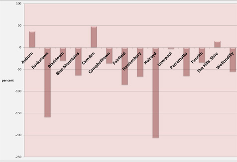
What I've done is take the current sub-regional jobs targets up until 2021 and observe how well each local government area is travelling based on local jobs growth over the last five years. In other words, have our LGAs been generating jobs at the rate we are expecting them to generate over the next ten years?

This graph shows the poor performance of Western Sydney's LGAs right across the board with two notable exceptions. One is Auburn whose job growth reflects a lively Parramatta Road corridor, the entrepreneurial nature of the local Chinese and Korean communities, but most of all a major jobs dividend from the Sydney Olympic Park precinct. The other is Baulkham Hills Shire which continues the successful north west—M2 corridor growth, and I'll say something more on this in a moment. And Camden is off a small base, so nothing too exciting there.
The other 11 LGAs have recorded poor jobs growth outcomes. The Blue Mountains, Fairfield, Hawkesbury, Parramatta and Wollondilly fell more than 50% below target. This is especially a worry for Parramatta being Western Sydney's much-looked-to business, commercial and administrative centre. Although one qualification: this shows the wider Parramatta LGA not the relatively more successful Parramatta business centre. And then the sorry story that Bankstown and Holroyd have actually gone backwards over the inter-censal period.
This is my summary, then, of how we are going in our quest to meet the modest jobs target.
- Sectorally, the news isn't good. Without public-sector led jobs growth, the sort of growth in health, education and public administration that comes automatically with population growth; without this growth it is difficult to point to any private sector group where there is jobs growth sufficient to offset the continued decline of employment in the manufacturing sector; and to meet our growth targets.
- Spatially, the news is also disappointing. Instead of a steady push towards the 'city of cities' objective, the idea that jobs growth should be concentrated in our major centres, we find that our centres are underperforming. Parramatta LGA is off the pace despite genuine local efforts. And as I've said, so are Penrith, Blacktown and Campbelltown. And Bankstown has gone backwards.
But does this matter? What are the consequences of not meeting the jobs targets?
I have three concerns, and I'm sure you will share them, or probably already do.
The first is that the failure to meet targets, and remember that these are very modest targets, is that there is now a real danger that social inequality in Sydney will become entrenched. My suspicion that is poverty is becoming entrenched in Sydney such that this may be for the first time in the city's history that somebody, anybody, doesn't have a genuine chance of having effort rewarded with a substantially better life than the one they were born into.
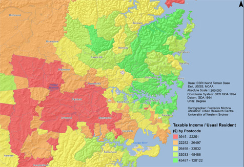
Interactive map of taxable income in Greater Sydney
We have constructed this map. You can find a copy in today's Telegraph in both web and print editions. The map shows the latest Australian Taxation Office data by taxpayer postcode. The data includes taxable income from all sources: wages and salaries, interest payments, dividends, capital gains and taxable government payments. We then aggregate every taxable income according to its postcode of origin. Then we use ABS census data to see how much work this income has to do according to how many men, women and children live in that postcode. Normally, maps like this compare pay-packets per individual earner or per household, and normally they are based on questionable claims people make on their census forms. But this is ATO data. Still dodgy in some ways, I'm sure, but the best we'll ever get nonetheless. Then we divide it among everyone living in that postcode. We think it is a novel and highly useful way of measuring income distribution. It shows actual dollars distributed among actual people. There is no black box manipulation involved.
The findings are stark. The red colour shows the poorest one fifth of income receivers, men, women and children. The income limit for this quintile is just $22,000 per annum, the concentration fills the corridor between the Great Western Highway and Canterbury Rd, with the Hume Highway running through the middle all the way to Campbelltown. The pattern is rather too neat and obvious for the real world, certainly for a globally successful, prosperous world city. The map also wonders out aloud where are all these aspirational belts of high income earners that Mark Latham and others point to without too much in the way of public evidence.
Then fold the map along its northwest axis, roughly where you might expect to find the golden bricks of the global economic corridor. The inversion of the red of the southwest is the deep green of the eastern suburbs, the inner harboursides and the north shore running from Chatswood, all stations to Warringah. This deep green, prosperous quintile commences at $45,000 per income receiver running through to $120,000 per income receiver.
Then, between the red and the deep green, the intermediate zones, light green through yellow and then orange, each a distinct quintile of incomes, these colours smooth the social division from deep green to red in a much-too-orderly social slope. I wonder of there is a city in the world where social division is read so easily across a set of Cartesian axes. You'd be very brave to say that this is a city where anyone can easily climb their way out of poverty.
There are two simple explanations for the extremes shown on this map.
One is that work in Western Sydney is harder to come by. As a consequence participation rates among young adults and among women are lower than what you find in eastern and northern Sydney. So each pay packet works harder once it comes through a Western Sydney front door.
The other explanation for the map is that each Western Sydney pay packet is thinner, so there is less to go around. And this comes from Western Sydney's high concentrations of workers in jobs and industries that pay less or where workers are in occupations where they under-perform their qualifications.
Meeting jobs targets, then, becomes a powerful way of addressing what may well be a very un-Australian social outcome: the presence of a large group of people who through no fault of their own are denied a decent go at the good life.
The second reason for taking the modest jobs targets seriously that it makes good sense economically. Any number of quality studies say that the way forward for a successful economy is securing quality workers in concentrations of business activity where the spill-over effects of co-location are readily harvested. The Macquarie Park corridor shows this, Norwest shows this, Sydney Olympic Park shows this. But where is the next site? And why isn't there one? And the one after that? Where are our Barangaroos?
And the third reason is doing nothing serious about meeting Western Sydney's modest jobs targets is bad practice for Sydney as a whole. A successful global city is one where people are proud of what the city does and what the city represents. The contemporary successful global city is a hipster city, a city where prosperity is a shared phenomenon, where social and territorial mobility are praised.
A socially divided city, with entrenched poverty and a reputation for car-choked roads and long distance time-poor commuters, is a city that lacks genuine pizzazz. It's one thing to look eastward from the Sydney Tower. But an international visitor will look also to west and ask what it's like out there.

Let me conclude with some simple public economics. Sydney has a plan, it has a good plan, and the plan has as its catch cry: 'The city of cities'. This means simply that the best way forward, socially, environmentally, economically, is to concentrate businesses and commercial activity into our major regional centres. This is all we have to do.
It's the Barangaroo lesson: site and build one Barangaroo in each of five regional centres or specialist centres in Western Sydney every inter-censal period.
Forget expensive cross-urban motorways and railways. Reduce travel times, work the road surfaces harder, let people walk and cycle to work, or get the bus. Relieve the taxpayer of the enormous expense of infrastructure. And save Western Sydney workers from having to cook the planet on a daily basis just by travelling to work.
Ends
19 April 2013
Mobile options:


