MESH
- Events, Workshops and Programs
- Resources by Discipline
- Support and Resources by Topic
- Contact the MESH team
- MESH Research
-
Resources for Staff
-
- Effective use of Zoom for Teaching Mathematics
- - Teaching aims
- - Online teaching challenges
- - Effective speaking
- - Effective visuals
- - Lecture slides
- - Involving students
- - Effective interactions
- - Obtaining student responses
- - Effective questions
- - Effective breakout rooms
- - Time management
- - Classroom management
- - Effective online pedagogy
- - Course design
- - Lecture structure
- - Tutorial formats
- - Presenting worked solutions
- - Guiding students to deeper understanding
- - Teaching students maths so they learn
-
- Effective use of Zoom for Teaching Mathematics
Lecture slides
Lecture slides
- Need a clear structure
- Use colour consistently
- Uncover slides bit-by-bit
- Don't crowd slides
- Lecture slides need to have a very clear structure. Make it easy for students to see the structure. Distinguish visually between the levels of the structure. Examples of structure might include levels such as overview, the key ideas and details or theory, propose, worked examples and practice questions.
- It should be easy to identify theorems, definitions and worked examples.
- You can achieve better student outcomes by using incomplete lecture notes – notes with blanks in them where students have to fill in key words and concepts – this forces students to more actively engage with the lecture, and draws their attention to the most important bits.
- If using slides, displaying the whole slide and talking through it is less effective than bringing the content up one line at a time. When you look at mathematics on a screen, it’s difficult to know where to focus – you can’t scan the text – and it distracts you from listening, so it is very easy to lose focus. It is far easier to stay focused when the text appears synchronously with the spoken word.
- Slides should not be too dense. There should be enough room for brief annotations.
- Use highlighting (coloured text, bold, underline, italics) to emphasise key words and concepts, not words on which you would place spoken emphasis. Highlighted content provides a summary of the slide.
- Slide titles should provide a summary of the slide within the context of the lecture e.g. “Differentiation – The Chain Rule – Another Example”
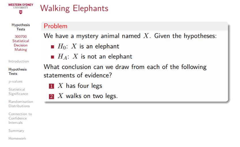
- Readers should understand the context of the slide from the slide itself. This can be achieved through various means, such as:
- slide headers and footers
- colour-coding (e.g. definition slides red, example slides green, exercise slides blue)
- page numbers
- table of contents bar (although this can clutter the slide).


Mobile options:

